
For your new signage to be effective, it is highly likely that you will need text and thus a typeface to be incorporated in some way, and it is crucial that this element provides customers with the information they need and in a way that makes it easy to draw them in and (hopefully) make a purchase. In this blog post we’ll explore the vast world of typefaces and tell you everything you need to know about using text in your signage!
What is a Typeface?
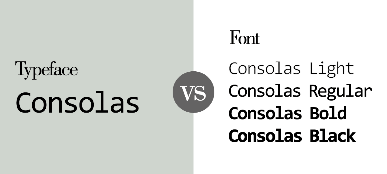
Typefaces are sets of letters, numbers and symbols that share a common style. They’re often used in print and digital media to communicate a brand’s message to consumers.
A typeface can be defined as a group of characters (letters) that have been designed with similar characteristics by the same designer or company, but there are many other factors that determine whether two fonts qualify as part of the same family. These include:
- Weight (boldness) of strokes within each letterform
- Width (condensed vs expanded) of letterspacing between characters within words.
Classification of Typefaces
Typefaces are classified in many ways. One of the most common is by style, which refers to how a typeface looks. For example, a sans serif font will have no serifs (the little lines at the end of each stroke) and may be more modern looking than a serif font. Another classification method is by function: what it’s used for (for example, headlines vs body text).
Typefaces can also be classified based on their structure – how they’re built up from individual letters or characters. Some typefaces have very few different kinds of characters while others have many variations within them; this makes them easier or harder to read depending on what kind of content you’re trying to convey with your design!
Design Principles of Typefaces
- The x-height is the height of a lowercase letter, measured from its baseline to the top of its ascender.
- Kerning is the adjustment of space between two letters.
- Tracking is the adjustment of space between all characters in a word or line of text. This can be done manually (by you) or automatically by software programs like Adobe Illustrator or InDesign CC.
- Leading refers to the vertical spacing between lines of type – the amount of “white space” between lines on a page or screen that determines legibility and readability for readers who are skimming over text without reading every single word individually.
![]()
Common Typefaces
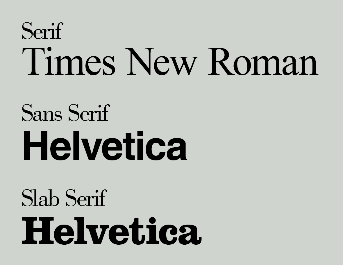
Serif typefaces have historically been the most common type of typeface to use, however in the last 100 years they have become replaced more and more by other types of fonts. They have small lines, called serifs, on the ends of their letters and at the top and bottom of each stroke in a letter. Serif typefaces include Times New Roman (the default font for Microsoft Word until 2007 with the release of Microsoft Office 2007 and Windows Vista, when Calibri – a sans serif font, became the new default), Baskerville, Garamond and Palatino, and our own primary font which takes centre stage as our headings!
Sans serif typefaces do not have serifs; instead, they have straight lines at the end of strokes within letters or on all sides of their characters’ bodies. Sans serif fonts include Arial (the default font for Windows computers), Helvetica and Verdana and our own font which is seen across our media as subheadings and copy!
Slab serif typefaces have thick strokes that can be either horizontal or vertical; they usually look like serif fonts but with thicker lines on top or bottom than normal serifs would have had if they were used instead.
Choosing the Right Typeface
When choosing a typeface for your business’s signage, you should keep in mind various factors, which we explore below:
- How easy is it to read? Is the font too small, or does it have too many curves? Does it work well with your brand’s personality and message?
- Does the font help guide the user through your signs by giving them visual cues.
- Mood/tone (if applicable). Does this typeface fit with what you’re trying to accomplish with your signage?
Further than these factors, it is also worth remembering your businesses own brand identity, which is almost certain to have its own outlined typefaces. It’s important to keep your brand consistent throughout the aspects of your business that your customer will interact with, up to and including the signage for your brands physical environment.
Many brands incorporate two typefaces, for examples, our own brand for Blaze Signs utilises a serif typeface as our primary text – used for headings – and a sans serif typeface for subheadings and long-form copy.
Best Practices for Using Typefaces
- Contrast
- Balance
- Flow
- Alignment
Best Uses for Different Typefaces
- Serif for print. Serif typefaces are best used for long-form reading, such as books and magazines. They have a classic feel and look more traditional than sans serif fonts, which makes them ideal for this purpose.
- Sans serif for web. Because of their clean lines, sans-serif fonts work well on the web because they don’t distract from the content you’re trying to share with your readers (or viewers). They also tend to be easier to read at smaller sizes than some other types of typefaces because they don’t have as many details that could get lost in translation when displayed on screen–and they’re easy on the eyes! Less important text elements of your signage could benefit from a sans serif typeface, for example, a stores address!
- Script for logos/headlines/subheads/etc. Scripts are generally used sparingly because they can be difficult to read at small sizes, and an additionally factor to note is a manufacturers ability to effectively bring the design of the typeface to life. However, if you want something eye-catching and unique (like an Instagram bio!), then this may be just what you need!
Tips for Combining Typefaces
- Choose contrasting typefaces.
- Match typefaces to the mood.
- Avoid combining too many typefaces (see above).
- Make sure you keep it legible and simple!
Conclusion
Typefaces are a critical part of any design project, and it’s important to understand how they work. The typeface you choose can have a big impact on the overall look and feel of your signage design, so it’s important to consider all your options before making a final decision.