
When you’re setting up your High Street store you obviously want to make sure your signage brings in the crowds. But what makes a sign that works hard to promote your business? Here’s some of the basic steps you need to consider when you’re working with Blaze to create signage that helps sell your business to your customers.
Do Some Homework First
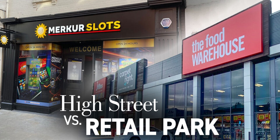
It’s so important that you spend some time thinking about your retail business, the market you are in, the range of customers you sell to and your location, all of which plays a vital part in the design of your signage. The more you make your signage appeal to your customers, and the easier it is to be seen when moving past your store, the more likely you are to get people walking through your door. This doesn’t mean you can’t be different to others – but you should always base decisions on what will deliver the best commercial return.
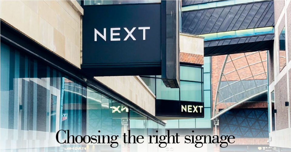
Size Matters
Your customers are going to be travelling past every day. So they need to be able to see your signage. It follows then that the larger your sign, the easier it is to be seen by your customers – and if your signage is small then it will be missed more often than not.
The location of your store is a major factor here. If the frontage is on a busy road, with traffic whizzing past, then you need to have large signage to catch their eye immediately. Similarly, you need to cater for people with poor vision. The easier it is for your signage to be read, the more people you are promoting your business to.
Clarity Is Everything
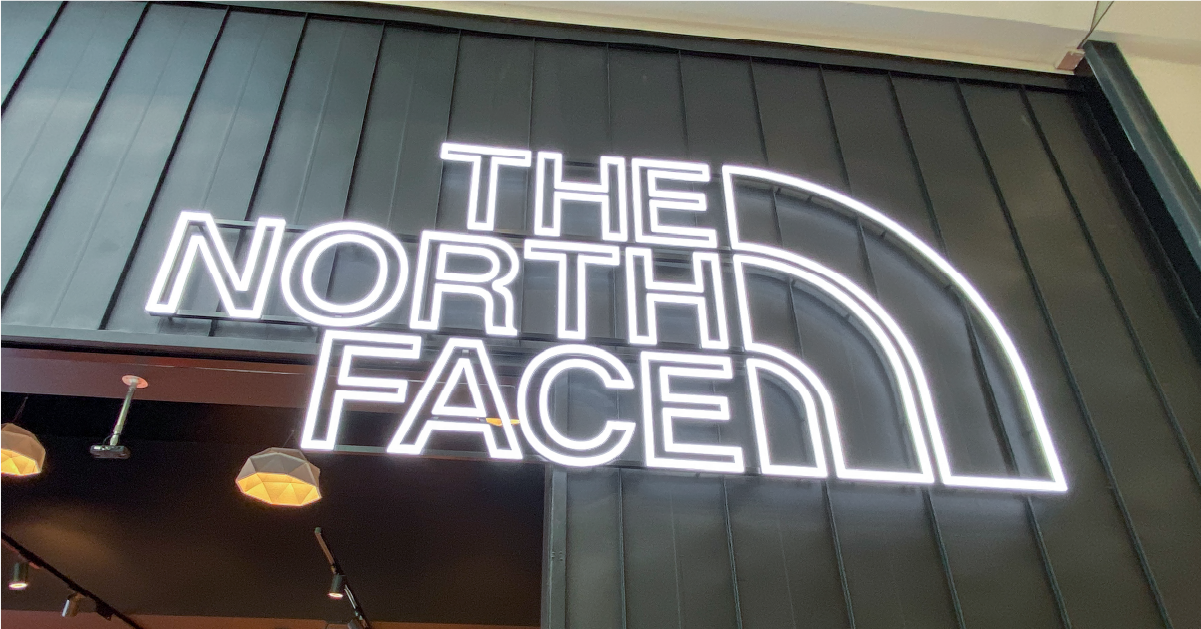
It’s not just the size of your signage that is important – the typeface and font you use is crucial too. There are hundreds of thousands of different typefaces available, and that’s putting aside the custom developed ones which major businesses develop. So, you have a massive choice, which can make picking just one a tricky proposition.
The first factor to use when shortlisting the typeface to use is ease of reading. Typefaces are grouped into two styles, Serif and Sans-Serif. A Serif typeface uses a flick, or serif, at the top and/or bottom of each character, think Times New Roman as a good example. Sans-Serif typefaces do without these end flourishes – Arial or Helvetica is a Sans-Serif typeface. For signage, sans serif typeface families are most commonly used as they are simpler to comprehend.
A little expert note here for you. The terms typeface and font often get mixed up a little, so we’ll clarify what they actually mean here. A typeface is a character family, while the font is the style of that family used. For example, Arial is a typeface, while Arial Italic Bold size 14 is a font.
Another thing to consider when choosing fonts is the clarity of the text itself. Obviously, you aren’t going to be able to reach prospective customers with Wingdings, but certain cursive and italic fonts are also super risky. It all depends on the visibility of the font from customers’ eye level. So, keep fonts on your signage that are clear and on-brand for maximum impact.
Except When It’s Not
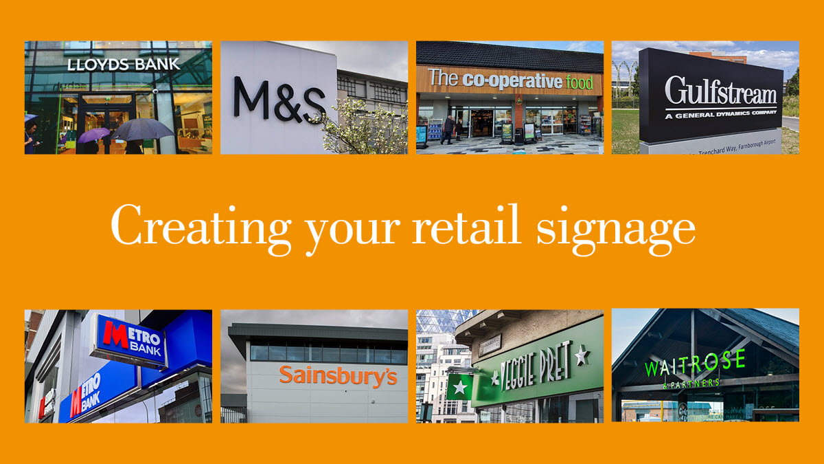
Not every store needs to use super-clear, well-space lettering within the signage. Some markets – fashion and cosmetics spring to mind here – like to dive into the typeface toybox and use anything that takes their fancy, or if it’s a celebrity brand just go with a signatures style instead. And of course some don’t even use a typeface but simply display their logo. Apple is probably the best-known example here.
The key differentiator here is branding. While any business will have a brand in some respects, for most it is more about their reputation with customers than the physical representation of their name. So a local newsagent will be mostly concerned with having signage that tells the passer-by what they sell. Which, let’s not forget, has always been the primary point of signage in the first place.
Don’t Forget To Look Up
When you have narrowed down your choice to a long list of typefaces, a good way to weed out the also-rans is to look at them from different angles. If you imagine your sign in position, it will be a little above your eyeline. The angle might change the appearance of the typeface – it could be more difficult to read, or just simply unappealing to your eyes. It’s a little like trying on new shoes; we all exaggerate our steps in them as we want to know what they will be like in all sorts of odd angles.
Those are a few simple points for you to think about when creating signage that actively promotes your business. Here at Blaze we’re ready to hear from you about your signage needs – so get in touch and we’ll happily listen to what you want to achieve and help from there.