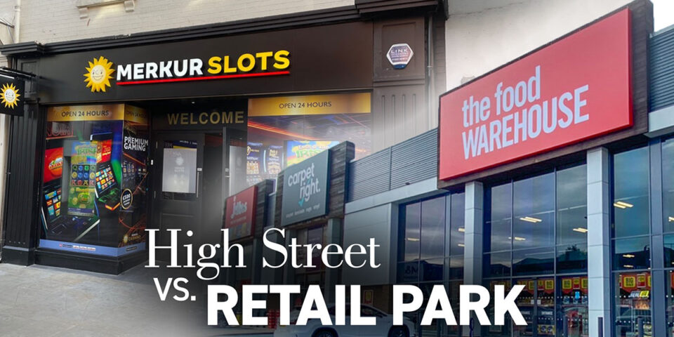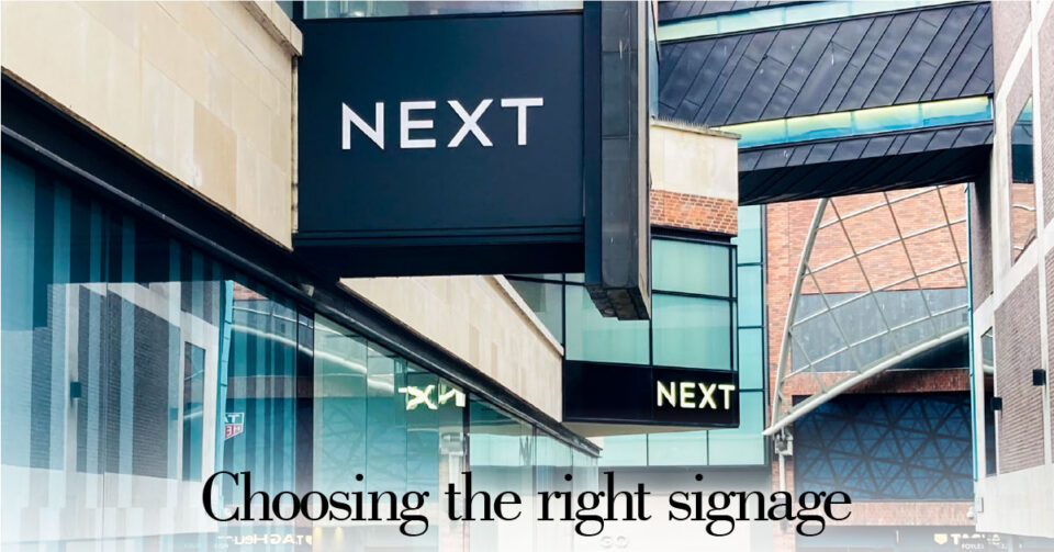

Have you ever seen a retail sign that confused you? They might be cluttered or in a weird position, or really hard to read easily. The third reason is more common than you might think. How you use colour in your retail sign is vital to attracting customers. Here’s a quick introduction for you into using colour in your signage correctly.
Before we look at specific colour ranges, the first point to make is the importance of using high levels of contrast in a sign. You wouldn’t use a sign with bright red lettering on a darker red background. It’s unreadable. But you should always strive to make sure your sign has a high contrast level. So you would typically use black with white and dark colours with light colours. Get this right and you can see an increase in customer traffic by over a fifth.
Moving along, you should consider what the perception of colour will have on your customers. Colours can evoke emotions, often subconsciously, with some having recognised associations with products and services. You need to understand how to these subconscious associations are generated by colours and tap into them to help improve the appeal of your store. Here’s a few examples.

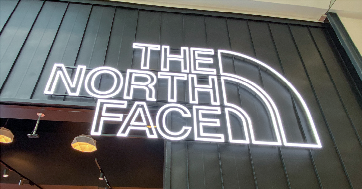
We’ll start with the monochrome black and white first. Black can have aspirational connotations with people as it tends to be associated with luxury. Brands using black commonly pitch their products or services at the upper end of their respective market; they will be perceive to be an ultimate in their field.

White, by contrast (see what I did there?) generates feelings of sterile, clean and hygiene. White is a popular choice for use by the pharmaceutical and wider medical profession. It’s also popular with bathroom and kitchen products (denoting the hygiene element here)
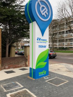
Moving on, if you use greens and blues, these colours can be calming, giving a perception of caring. A good example here is bright green being popular with eco brands. The darker hues in the blue and green ranges can generate feelings of trust and professionalism, which is why you see them used by major corporations such as banks.
At the other end of the cool colours is the warm spectrum – the yellow, orange and red range. These are more powerful colours and can invoke more overt reactions in the customer. Red in particular is a colour of emotion and passion, while yellow is openly friendly and welcoming. When used correctly they are great colours for signage.
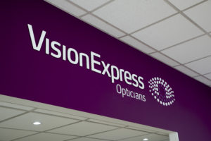
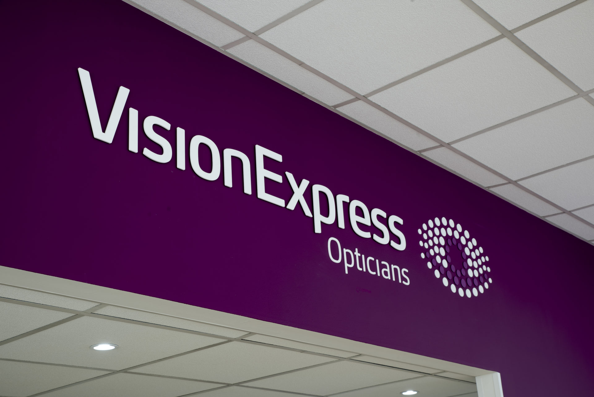
Beyond the cool and warm ranges you also have distinct ranges such as purple, which can combine perceptions of other colours. Purple (a colour heavily used in Christianity) is an excellent example; it is both calm and trusted, can project luxury connotations and be used in health sectors. It’s a colour that plays very well against white for jewellery, cosmetics and wellbeing products.
There’s a few examples for you about how the use of colour in your signage can affect your business. We’ll come back with some more detailed examples in each colour range soon.