
Did you know you can see more different shades of green than any other colour? If you were to take a look at 100 brands and the colours they use, you would find green pop up far more than you might expect. That’s because the colour green has a surprisingly wide range of perceptions. You could say green is the chameleon of colour.
For example, historically green was viewed (rather simplistically) as a ‘calm colour’. More recently there has been a rise in associating green with the environment. In reality, green has a lot more depth than these two points. It’s impact on a brand can change depending on shade, business sector, even country and culture too. The key here is to look at how green is used in the context of the business itself. So let’s take a look at the use of green and how it can create so many different reactions.
Quality And Aspiration
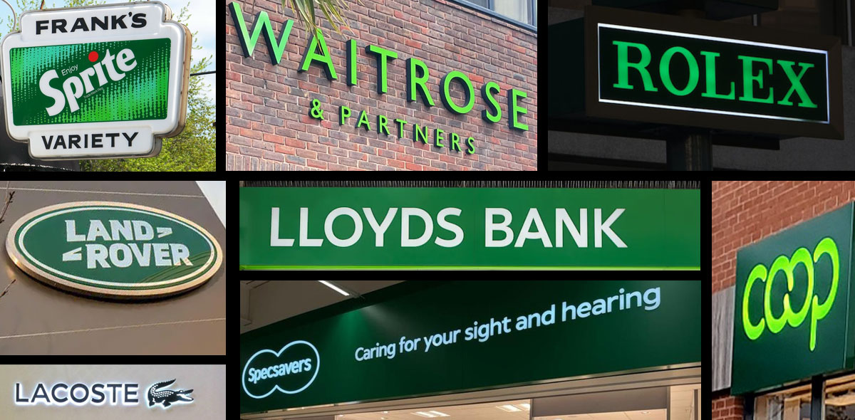
Green can be found in many brands looking to create a perception of luxury. High-ticket value brands such as Land Rover, Lacoste Aston Martin and Rolex are users of mainly darker greens. In finance, green is a historic colour used in banknotes (hence the American term ‘greenback’) and remains a popular choice in brands; Lloyds Bank feature green throughout their branding.
In the same vein as darker colour shades, green can provide a perception of quality and a strong element of aspiration. Green helps to elevate the perception of a brand such as Rolex compared to others. It helps to cause desire and other strong emotions within people.
Care
We cannot ignore the extensive use of green by brands that want to create a perception of care. So green is a popular choice in many charity and retail brands; they want their market to perceive them as responsible. For a customer, choosing these brands shows their desire to be caring and responsible too. That’s why you will find green used by brands within retail sectors such as food and housewares. Their aim is to project a strong eco-friendly element to their product. Similarly, charities such as Friends of the Earth, Groundwork and Greenpeace use green to project their concern for the environment. The same message is true for public organisations and initiatives such as The Environment Agency or Keep Britain Tidy.
It’s useful to add a note of caution here. If you want your brand to be perceived as eco-friendly, you have to show you really are minimising your impact on the environment. Trying to reach the levels of sustainability reached by Body Shop (another user of green in their signage) is a challenge, but the alternative is to be accused of greenwashing. And when you consider that a 2017 survey found three-quarters of consumers would refuse to buy a brand that did not turn out to support their beliefs in reducing their environment impact, it’s vital you avoid being called out.
Fresh
Perhaps slightly complicating matters here; brighter greens also convey a feeling of freshness. It’s no accident that ASDA use a bright green within their branding. The business began as Associated Dairies (hence the brand name) and their brand colour attempts to position them as a retailer of fresh foods. The same also applies to Subway, who use green to emphasise the freshness of the food sold at their outlets. The freshness connotation also applies with greens moving towards the blue spectrum.
Youth
Brighter greens can also project a youthful perception. Arguably this is more from the vibrancy of the shade used, but bright green features in brands such as Monster Energy, Sprite and 7-Up.
Trust
If there is one common perception that links the range of green shades it is trust. Customers view green as a ‘conviction’ colour; they can invest their confidence in the brand and believe in the values it conveys.
Are You A Green Brand?
So, armed with the details above, would you say you are a brand suited to using green? And if so, would you want to use darker shades to convey luxury, or lighter greens to talk about youth or freshness? And would green help you advance the perception of your brand as sustainable? With green as the chameleon colour it can be tricky to decide. Here at Blaze we’re ready to help you understand the importance of colour in your brand, and invest in signage that really stands out. So get in touch and we’ll happily listen to what you want to achieve and help from there.